


Just when you thought it couldn't get any worse:
http://www.wizards.com/Magic/Magazin...ly/feature/281
I don't mind smaller borders, but the new designer credit and holofoil stamp for rares/mythics look fucking stupid.

Possibly as a way to make counterfeiting more difficult?
Originally Posted by Richard Cheese

I haven't thought about it that way. Sounds like a reasonable explanation, especially with the recent surge of better fakes.
Was hoping for future sight frame!

The problem is that the real high-value cards you'd want to counterfeit don't have this holofoil thing. See: dual lands, fetches, Legacy and Modern staples.
I guess they'd be targeting people trying to make copies of mythics for Standard, but I feel like the volume of cards being opened these days is so high that even the priciest mythics don't stay that way for long.
Also, the new card frame tweaks are...unattractive, to say the least. I don't like how jagged the new font looks and the colored frame not wrapping around the bottom is ugly. Does someone in WotC have a fetish for screwing with the card frame or something? They do shit like this all the time. You wanted to save your tweaks for a batch because you don't like tweaking too often? You made a new card frame for gods in Theros, one for Miracles in Avacyn Restored, a modified frame for werewolves in both sets of Innistrad block, one for levelers in Rise of the Eldrazi, and possibly more I'm forgetting. EDIT: Oh, right, and Time Spiral block.
But, eh, whatever. In terms of aesthetics, nothing will come close to the old card frames for me (although the ones we have now are somewhat easier to read).
I agree, I love that frame in a nonironic way.
However for this news what's the big deal. With Miracles and Enchantment/Artifacts in the last two sets they have been messing with the borders a lot lately. At this point I don't even really notice it. These do kind of look kind of ugly, but good thing I play Legacy and don't have to worry about it until they print something busted.

I second this. I was livid back in 2003 when WOTC got rid of the old frame; now I don't really care. There have been so many other frame and design changes that this just doesn't matter that much. The holofoil looks dorky and moves the design closer to Pokemon, but flip cards in Kamigawa and transform cards in Innistrad block were travesties by comparison.
I don't even care. It's such a slight difference. It isn't like the old to new border

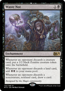
So do I understand this correctly...THIS will become the new standard frame? I mean the red card looks pretty damn ugly to be honest, it just looks so discontinuous in terms of colors. Luckily you won't notice it too much on black cards as seen on Waste Not but the aesthetics of non-black cards are hurt pretty much in my opinion. I honestly think that this isn't even a question of customization like it was with 8th edition, this just looks like a mutilation of the modern frame..
Preventing counterfeit? If I were to make counterfeit cards I'd start with duals fetches fows, leds and the like, not some shitty, and easily accessible standard cards.
Seriously the most expensive card in standard is Mutavault around 25 bucks, it seems kinda fair price for a format staple.
Thing is, Standard stuff isn't checked near as thoroughly as horribly expensive Eternal cards that tend to be worn out a bit.
Also, Paint.tech:
Not hard, WotC.


This is horrible!Each time they changed the frame, the cards looked continously less like a card of the color it represented.
Old frame cards looked really colorful and had this special feeling to them. I absolutely loved the bubbles in the frame of old black cards, for example. When they changed the frames last time it really hurt my eyes as there was a lot of flavor lost along the way. A lot! But now we have THIS and it really makes we wonder how this is supposed to be an improvement.
I am really really sad
The seven cardinal sins of Legacy:
1. Discuss the unbanning ofLand TaxEarthcraft.
2. Argue that banning Force of Will would make the format healthier.
3. Play Brainstorm without Fetchlands.
4. Stifle Standstill.
5. Think that Gaea's Blessing will make you Solidarity-proof.
6. Pass priority after playing Infernal Tutor.
7. Fail to playtest against Nourishing Lich (coZ iT wIlL gEt U!).

totally agree. I directly quit the game when they they began to print cards with new frame last time.
Team Blood, Beijing.
Currently play: Sneaky Show/ Lands
^ Everything I want to say.
Plus, as a completely subjective comment, the design is flawed as the cutoff line for the unnecessarily shorter color frame doesn't align with anything meaningful and loses its function as a frame as it is not covering a meaningful area. If they wanted to spare some space for the new black bottom a better approach would have been to gradually fade the color to black. But black being a frame color itself this whole thing is still flawed. Any visual arts people in the forum, please back me up here. These are basic principles.
One last thing. If only wizards could say only for once, based on the community feedback, that they've made a mistake and decided not to go forward with a decision that would go a long ways towards earning respect from many of us long time players.
Legacy: Rituals
Vintage: Drains


You guys find something new to cry about every week, or am I giving you too much credit? Seriously, the frame on the card could be a million donkeys and I wouldn't give two shits.
TL;DR- The Source: Your source for daycare training
Team Hammafist-We don't take kindly to those who don't take kindly."Got any trade boogas?"
Aside from nostalgia this frame seems a lot worst than all the previous ones.
The stamp seems childish to say the least, but i like the informations on the bottom left corner.
- L
This looks acceptable. No idea why they had to make this ugly cut-off.
They could also use that to expand the coloured border to the physical border of the card, doing away with the black outline entirely. More colour on the card, and the card feels bigger too.

Meh . . . they're ugly as hell, but it doesn't impact the way the game is played other than maybe the use of proxies from this set onward.
What really gets me is the reasoning behind each of the four major changes.
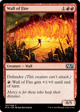
1. The font - Wow ... not only does no one give a fuck if you designed your own font or not, but when you compare Waste Not to Dying Wish, nothing seems to have changed! So useless and unnoticeable.
2. Holofoil stamp - So ... authenticating standard and limited fodder is a thing now?
3. Collection Information - You guys aren't Yu-Gi-Oh!: y'all have a working database where we can look up the collector information with ease. We don't need redundant (set, rarity, language) information to clutter the card either.
4. New card frame - It'd have been nice if didn't look so jarring and ugly: at the very least just get rid of that curve at the bottom so its more square.
Once again, meh changes, rage-inducing reasoning.
There are currently 1 users browsing this thread. (0 members and 1 guests)


 Reply With Quote
