I've never really been a fan of alters for my cards, but I think drastic measures might be on the menu
Originally Posted by GreatWhale

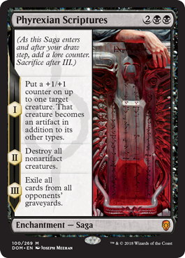
I kinda like it. I imagine we'll see a few more iterations of this design space in the future, with Contraptions playing very well and now these Saga enchantments.

The leak might have been actually helpful for the reception of Sagas. This looks like ass, despite being very functional.
Whoever designed this (or the Amonkhet invocations) has no idea what pleasant Magic card design looks like.

Yeah there is more than enough space to do this in a traditional text box, they are making it fancy and different just for the sake of it.
I hate decisions like that, but they obviously have people who like them.
Quote from Mark Winters »
Each Saga will look very unique from each other. The art styles vary wildly.
So this is just what the Phyrexian one will look like, so expect things to look very flavourful for these. I'm glad they all won't be like this.
Lol, they didn't learn anything from amonkhet masterpieces.
"this does not look like a magic card"
"this does not look like a magic card"
"this does not look like a magic card"
"this does not look like a magic card"
"this does not look like a magic card"
"this does not look like a magic card"
"this does not look like a magic card"
"this does not look like a magic card"
"THIS DOES NOT LOOK LIKE A MAGIC CARD"
They will get fried on social media. If anything Dominaria should hearken back to the OLD days. Inverted Future Sight frame would have worked.
The response on social medial is very mixed so far. Some like it, some don't.
Reminds me of a Netrunner card. Very sneaky Garfield.

I don't mind the look of Sagas really... Anything that adds good design space for enchantments is welcomed by me (bestow was the wrong direction... Saga seems more intuitive).
It'll be interesting to see how they interact with the rest of Magic's card pool.
Mind Unbound
Myth Realized
Scroll of the Masters
Hell just use the Level Up frame from Rise of the Eldrazi. I can't tell if I'm hopeful or not one the fact that they're all apparently different. Could be flavorful, but more likely they'll look like a mess.
If the textbox was transparent or at least semi-transparent (like on the full art gameday cards) I think this would look sick
The entire left half of the card being a stark white rectangle is not A E S T H E T I C
I think the art itself is very cool, I love the techno-horror phyrexian stuff

I would like to see planeswalker in this form. You will have the full picture of the hero.
I am curious about the rule change/adjustment.
"On Monday, we'll release the mechanics article by Matt Tabak and an article from Aaron Forsythe about the rules changes coming with Dominaria."
Maybe they will bring back old legend rules
I also just noticed that they guarantee at least 1 legendary creature in every pack.
That bit of info flew under my radar on the first pass.
Time to make another EDH deck maybe
The rules changes were discussed in the notes release already.
They are changing the way you do direct damage to planeswalkers. No longer do you target the player and redirect to the planeswalker. Now you outright target the planeswalker.
-All instances of "target creature or player" and "target player" from cards printed prior to this set are being errata'd to "any target" and "target player or planeswalker" respectively.
-Any card printed in this set going forward will specify.
-The new dual deck Chandra has a -3 to deal damage to "target creature or player" but is printed in this set, so it cannot deal this damage to a planeswalker.
The art remember Dark Ritual from Urza's Saga... get it... Saga.
I don't care for the frame if the art follow that line.
Enviado de meu SM-G900MD usando Tapatalk
What this also means is you can't redirect global damage to planeswalkers. "X damage to each player/opponent" texts got a big nerf with these rules. Fiery Confluence, so sad.
I think the biggest gripe with invocations is simply that the design sacrificed too much for too whatever aesthetics they were looking to achieve. Drop shadows, different borders, bidents and gold leaf on top of their hieroglyph text meant they had to jam all these different design elements into a card face that typically only had to manage half that. The elements fight with each other as well as the rules information which clutters everything needlessly. You can just look at the other masterpiece card designs and see how they have utilized far fewer design elements to create a much more cohesive and aesthetically appeasing design while still having a flavor focused design. Overall the invocation design would have been much more successful if they focused on a few things and cut the rest out, drop shadows took up so much of the card face, remove some bidents (repeating the icon up to 4 times on a card face is excessive), the smaller art panel is basically contrary to what these types of cards were meant to accomplish.
My criticism for the saga enchantment is that splitting the face that way automatically leads to problems in text justification. You can see that large portions of the right side of the card frame are not utilized because the text just doesn't fit. Again, it looks like the relative size of the artwork has been reduced, it looks like a 50/50 split with the text, whereas normal cards have art taking a larger percentage of the face. I suspect that this face will look far better in Asian languages where the characters are able to actually use narrow text frames better. Even then, I think reducing art size is something that should only be done if you have a very good reason to do so.

I've seen a number of people say they like the way they look, or at least don't really have any issue with it. This is a pretty far cry from the Amonkhet masterpieces where I didn't see a positive response from anyone, unless you count jokes about "Hazoret the Pervert" as a positive response.
I dunno, after classic frames I'd probably put Future Sight borders as the next best followed by Amonkhet promos (well, if they weren't foils). Modern frame is hideous, even worse than Zendikar expedition stuff...
There are currently 1 users browsing this thread. (0 members and 1 guests)


 Reply With Quote