another combo deck in the making, but right now i'll just settle for English though. i'll post the rest of the deck
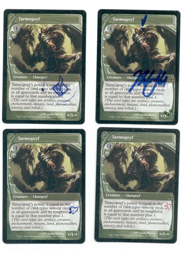
once i sleeved up 4 of these babies

does this combo deck include dream halls?
Favorite Card: Dark Depths
Originally Posted by umbowta


after several weeks of separation are back again forever changed ! 8-)
In a comparison Foil Jap which seems very light compared ...

Those put even my Goyfs to shame.

Exodus prints (plus the Hippo) were extremely expensive a few years ago, in the five digit range for a set (one each). They aren't anywhere near as expensive now. Probably due to people realising that there were more than initially thought. This isn't me trying to devalue the cards or anything, as I'd have a lot to gain from the prints being expensive.
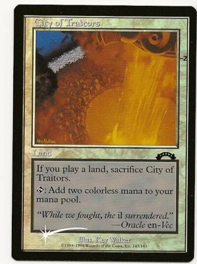
As promised, the first of the CoT playset.
The Exodus test prints are inarguably the closest to what a person would define a "test print" as in narrow terms, as not just the foiling process was tested, but various other aesthetics as well, in a far great range than any other test print (save perhaps UNL ones, if people count those as test prints). The aesthetics (for the black-bordered ones, which is why they've always been above the sb ones in the eyes of most collectors) tested included text box, darkness/contrast + colour strain, the colour of the set symbol and intensity of foiling. When I post the rest, it can be observed that the set symbol looks different for 1-2 of them as well.
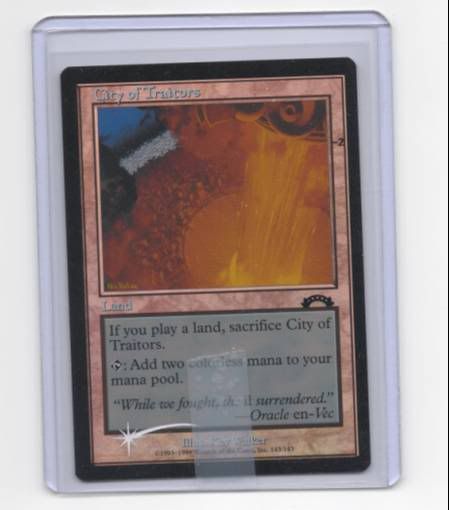
I've scanned one of my two favourite CoTs, and am now deciding if I should risk playing them, and what deck I should use to house them.
Oh, and as a general question of taste, say I could get either a US textless Cradle or Bolt for the same price, which one should be preffered? Ideally both eventually, and I'm leaning to the bolt for now, but the cradle is appealing too.
Edit: Realised that my scan somehow made the card look crappy. Ben was right in saying that Exodus prints look great, and the second scan does the card better justice.
One must imagine Sisyphus happy.


Wow, so cool! Are they all black-box or just all black-bordered?
Men yet not comprehending their stick in the scheme of the prey-on-prey ballet of ending day
My eBay Auctions (art alterations! I FIXED THE LINK) - http://shop.ebay.com/yawg07/m.html

Very nice Cities. I'm actually jealous :)
Just a question, how much is a textless Cradle worth? For my Legendary collection, I think I should try to get one to sit next to my normal and Judge foil one.
4th: 293/363
5th: 82/434
Vi: 159/167
Wl: 100/167
Te: 318/335
St: 132/143
Ex: 136/143
US: 235/335
3/8 Sealed boosters
1/8 Sealed boosterboxes
Only 632 cards left for a full Korean set, over 69% done (last update 05/27)
Always looking for sealed product!
My EX stuff is all black-bordered, except for a sotf. They just look better to me, with the black borders and foil shooting star. Plus some of the aesthetics were only tested on black-bordered prints iirc. I only have this black text-box piece though. The rest are not, and look considerably different as well.
It's just 1 city thus far. The scan I took in the toploader just looks really crappy. Some people would say a textless cradle is worth about 3k. Don't believe them. Somewhere about half, MAYBE a bit more.
One must imagine Sisyphus happy.
I usually dislike alterations that are not made by the artist of the card, but those Tarmogoyf are just magnificient.

Occam, is that "-2" on all the City of Traitors test prints?
Rules Advisor

How much work does it take to get a set of stamped Tarmogoyfs? There can't be that many in existence...
Magic Level 3 Judge
Southern USA Regional Coordinator
6 months, maybe a year. It was tough.

Can someone enlighten me about stamped cards/Tarmogoyfs? Where are they from/why are they special?
Who says the Internet isn't full of <3?
They are stamped because they were used in PT play. Nothing all that special.
All the black bordered prints Exodus have a number in that area, another reason why I like them. I'm not really sure what they are indicating exactly, but my guess is that the darkness/contrast between the spare portion of the card (that greyish area that exists on the card) is indicated by that number. There are prints with +/- 1 to 3, and some with just 1. The ones with + are darker in increasing degrees indicated by the number, and that area of the card is also tinged with whatever colour the textbox border is. So, one with a red textbox would have a reddish hue if it is +X. My others are two +3s and another -2, so you can see the difference there. There are also permutations for the textbox colour for every card type in magic. Some are very beautiful, and while I like all of mine, I wish I had some others whose look I like too.
Edit: I might have other EX prints with other number combinations too. I know most of my stuff is +1, but I'll take a look at those I can't recall soon, and maybe I'll borrow scans of the rest from other people (giving them credit of course). Perhaps MattH can post his as well.
One must imagine Sisyphus happy.

Ah so that's why my Planeshift Meddling Mages have stamps. They had a little Easter Egg on them. I have always wondered what that was.
Oh, yeah, I knew about that. I never knew it was "pimp" to have stamped cards. I assumed (wrongly) that it must have been something more special I was missing. Thanks.
Who says the Internet isn't full of <3?
I scanned my cards:
http://img19.imageshack.us/img19/127/001kc.jpg
http://img32.imageshack.us/img32/6577/002xht.jpg
Images are large which is why I am linking them. Somehow the images being large did not prevent the scans from being crappy; the cards look better IRL than that.

lol the funny part is I think I've seen those stamps (the "sun" and "arrow through heart") at teacher supply stores


Quick to the teacher supply stores!
There are currently 1 users browsing this thread. (0 members and 1 guests)


 Reply With Quote