


Holographic authenticity indicator on rares, mythics, and foils:
More info on the mothership
Originally Posted by Dice_Box


Like I said, in the other thread, possibly a way to make counterfeiting more difficult

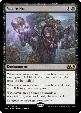
Aside from the new border and hologram, there's nothing i don't like about Waste Not.

Love the new border. Ever tried to read collector's numbers on non-white/artifact cards? Frickin' impossible.
Much better now, and I like them being proactive about counterfeits.
Good idea, although it's not really nice visually.
My main problem with the many versions of MtG frame is that when you play the cards of different editions (and this is esp. true for Eternal with its deepest pool), it's like when you're playing several different games at once. I know that it's too late to mourn the fact that there was no counterfeit protection at the very beginning of the game (who would have guessed what MtG will become over next years and that the Moxes will be worth their weight in gold), on the other hand, I still think that a watermark would work the same and won't be that... well, not really ugly, but the hologram is very, very unusual to say the least.
EDIT: Although I like that one may easily gain all the needed info about the particular card from the card itself, I dislike how they've done it. It's really ugly and it definitely should have been made in a smaller font. From now on, all the cards will look like an EU-normed pack of biscuits.
"Tarmogoyf, 4/5 package. Green monster. May contain small portions of soya, eggs, nuts, almonds and chilli.
That new border is just plain ugly to me. And I don't see the use. I never ever have been interested in the information stated there.
The expansion is known with the symbol (where there was soom room for a number if needed), the rarity as well (these days, and that works fine).
So that's really lame and possibly done under pressure from artists to show there name or something. Otherwise there really isn't a goof reason to do it.
The hologram (counterfeit) is fine.
The new font is fine.
Smaller frame all around is fine.
The colored edge dissapearing at the bottom is ugly. And they know it, that's why they start with a black card where you don't see it. Imagine how ugly this will be on the other cards as well and why? for information that's irrelevant to many and never relevant during a game?
Yes, I know. Magic will stay. The sky isn't falling and I'll keep playing the game. Doesn't mean I have to like this. I really hope they change the border back after M15 and not just the credit (which is funny as a one time thing).

Awesome, they actually made Waste Not playable!
I was dreading a 4cmc 2BB enchantment, or something. This is nice!
OT: They are ugly.
Bring back OLD frames.
New frames are ugly. I really hate that holo-stamp.
Emptying the Warrens: So YOU don't have to!

It reminds me of Pokemon cards?
The holo deal isn't a bad idea, but could be executed better, perhaps without revamping the border.
And what's the point of the language indicator? It seems redundant, I even caught on and can distinguish between Chinese, Japanese and Korean.
Deadguy Ale, U/R Painter


Does the black new frame add anything relevant to painter servant/ circle of protection black/ bad moon? Lol


This thread is why we can't have nice things.
More changes that benefit WotC but not really players.
“It's possible. But it involves... {checks archives} Nature's Revolt, Opalescence, two Unstable Shapeshifters (one of which started as a Doppelganger), a Tide, an animated land, a creature with Fading, a Silver Wyvern, some way to get a creature into play in response to stuff, some way to get a land into play in response to stuff (a different land from the animated land), and one heck of a Rube Goldberg timing diagram.”
-David DeLaney
How do these changes ONLY benefit WOTC?
More importantly, even if these changes only benefit WOTC, what makes the difference? I think it's a good change that will benefit everyone.
It's ugly. That holostamp and new font can be cool, but the bottom of the card looks like ass now, with the new frame. They made the bad new frame even worse.

Let's compare the actual card with user-made variants:
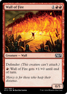

Those asymmetrical, random cutouts look pretty bad. Seriously, what the hell were they thinking?

At least the lines work fluently with the P/T box, which tells me everything.
www.theepicstorm.com - Your Source for The Epic Storm - Articles, Reports, Decktech and more!
Join us at Facebook!

I'm sure the next change they'll announce will be a price increase on boosters because of that foil stamp.
Out of the 3 versions Barook posted, I prefer the far right one.
So do I.
I would have prefered just putting the old foil star instead of that circle.
Something like this:

There are currently 1 users browsing this thread. (0 members and 1 guests)


 Reply With Quote


