Not even close to original foils. Over-priced and over-hyped.Originally Posted by MGB

Personally, not a fan. Like most things in life, it's a matter of aesthetics; like asking what type of woman/man people like, you'll get various answers.
Personally, I prefer original fetchlands for the most part, although I like the look of the KtK Bloodstained Mire.

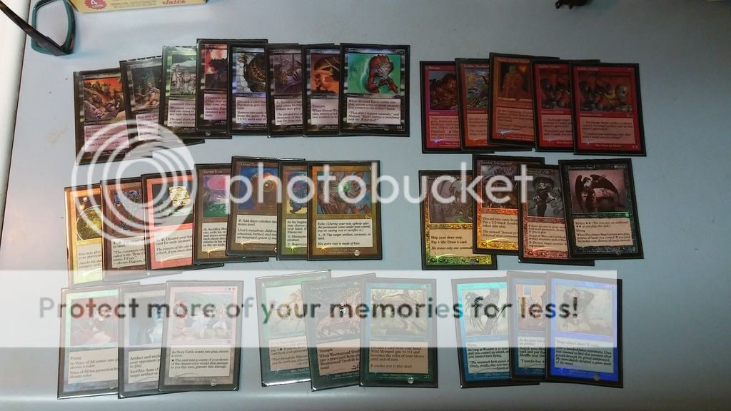
What can I say? My cube likes the old border.
(yes, there's multiples in the cube. Sue me.)
I nearly forgot...
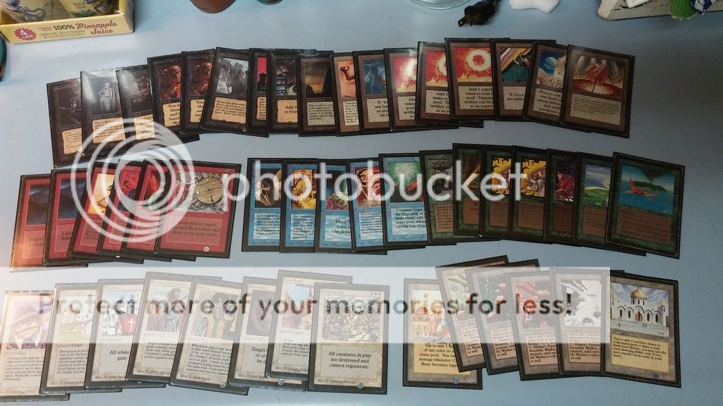
No winter factory? How much did you pay for the pineapple juice? Nice cards!

There is a Winter Factory in that pic.
On the pineapple juice; do you think they would come back as a BGS 9.0 or better if you sent them to be graded?
I really like old border or old school cubes, both to play and to masturbate to. Does anyone have any favorite lists?

You need "I'm with stupid --->" shirts to give to the guy who ends up with all 3 Sol Rings after the first pack.

Hey guys,
can anybody help with that?
http://www.mtgthesource.com/forums/s...an-Mtg-artists
Currently playingEldrazi

There are a number of issues with this promo that I see.
1 The foiling is not well done. It's not as bad as FTV but it looks much more plastic-y then regular foils.
2 The holo-thingy. Obviously we have to put up with this on new cards but when you have an option of an older card without this, this non-holo-thingy card MUST be preferred.
3 Average art. Some of the pictures are OK but overall the art is pretty ordinary. Earlier versions of most of the cards had art as good. If they were spectacularly beautiful like the Judge Promo basics then we'd have a different story.
4 Condition. Every one of these opened in NZ was damaged with edge wear. Wizards are talking about replacing them but there will be a lot of copies out there that are MP.
5 Rarity. This is the big one - just how many of these things are there going to be. The jury is still out but there seems to be more opened than the previous time they did this sort of thing at Zendikar. As cards are reprinted rarity has to be determined based on each item but if you want a truly rare card there are far better options than these (Jap foil/Russian foil for example).
I won't be getting any and I wouldn't recommend someone using them if they wanted to pimp their deck.
mtgpimp
Good idea, I ripped the pineapple juice from a new Zendikar booster. Apparently Wizards new promo - randomly inserted mythic drinks.
(actually it's just there for the occasional dry mouth)
"I wouldn't recommend people having different opinions as mine."

I'm not a fan too much either. Most of the art for them is terrible and I agree with the foiling too.
Kinda ambivalent myself.
There are some definite negatives.
-The M15 card frame, the "Beleren" font, and the holofoil stamp look like shit.
-They aren't truly full art; the text box really intudes upon the artwork.
-The art is often Zendikar specific (i.e. hedrons all up in this shit) and that can be a turn off.
-They're only in foil, which is a turn-off to those that like more subdued (and tourney-friendly) pimp.
But there are a few positives.
-The allied fetches are done by Veronique Meignaud and are beautiful. I like Alexander's and Anthony S. Water's artwork a lot, but her work can, at the least, give them a run for their money. No real opinion on the shocks and enemy fetches.
-I like the hedron-rune borders. One of my biggest complaints about the Eighth Edition frames are that many of the card borders became a lot less stylized, more bland, and didn't have a lot of richness and detail...especially compared to the classic frames. The expedition borders, like the Planar Chaos, Future Sight, and Innistrad flip borders, are generally improvements on the 8th-forward card borders (but still not as good as the classics).
The foiling process on them is a huuuuuge turn off to me since it's like the crappy FTV foils (the front feels all slick and glossy). It's too bad because I think the Misty Rainforest has especially good art, even with the stupid hedron.

+1
Misty is gorgeous.
More photoshop effect vomit, and an additional border to make a deck look like a mess, and new, and only english, and foil, and hedrons. Wow. These are for children playing modern to impress their younger children standard counterparts.
I fear this is the new normal. The cards in general (including normal foils/non foils) from the BFZ boxes I've cracked are glossy the same way that MM2 was, but not as bad with quality wise.
As for looks, the blue fetches are alright, especially compared to the other available arts (You can't tell me the Onslaught Flooded Strand/Polluted Delta art is actually good and not bland as hell, and KTK isn't that much better). I especially love Polluted Delta. However, the english only part is going to make me sell mine off. But for people that go with english foils, I can't really critcize them if they go with Expeditions.
Remember when MTG art involved a paint brush? I do and it was way more aesthetically pleasing than this nonsense.

I am not planing to get them for my Lands build. I will stick with the old Onslaught set foils with a single foil set Misty. Just so much better that way.
Will get that new Port though. Waiting. Waiting.
It is better to ask and look stupid then keep your mouth shut and remain so.

I mean, even the new kids who see Ulamog and go "wooooah" have wet dreams over shit like Survival of the Fittest.
There are currently 1 users browsing this thread. (0 members and 1 guests)


 Reply With Quote